
Advanced Scientific Matplotlib - Part 1/n
This series of blog post is here to give some of the tricks I use to produce high-quality figures, suitable for publications.
Introduction
Of course I am using matplotlib to create all sorts of figures and animations! Coupled with numpy and somethimes pandas to read and handle all sorts of data, these are some very powerful tools. I am not going to cover the basics of matplotlib, such as importing the library, or doing simple plots. There have been lots of excellent examples on the subjects already.
Instead I will dig a bit deeper in what matplotlib has to offer and how we can benefit from it to show the results of our research.
Using Style Sheets
Custom style-sheets are a very efficient way to improve the default plotting style from matplotlib. You can get some excellent one from here. Once they are installed in the correct directory, you can simply use them with
plt.use.style("my_amazing_style")
The style-sheets are save in a .mplstyle format. Here is an axample from a basic style sheet
# Matplotlib style for general scientific plots

# Set color cycle
axes.prop_cycle : cycler('color', ['0C5DA5', '00B945', 'FF9500', 'FF2C00', '845B97', '474747', '9e9e9e'])

# Set default figure size
figure.figsize : 3.5, 2.625

# Set x axis
xtick.direction : in
xtick.major.size : 3
xtick.major.width : 0.5
xtick.minor.size : 1.5
xtick.minor.width : 0.5
xtick.minor.visible :   True
xtick.top : True

# Set y axis
ytick.direction : in
ytick.major.size : 3
ytick.major.width : 0.5
ytick.minor.size : 1.5
ytick.minor.width : 0.5
ytick.minor.visible :   True
ytick.right : True

# Set line widths
axes.linewidth : 0.5
grid.linewidth : 0.5
lines.linewidth : 1.

# Remove legend frame
legend.frameon : False

# Always save as 'tight'
savefig.bbox : tight
savefig.pad_inches : 0.05

# Use serif fonts
font.serif : Times New Roman
font.family : serif

# Use LaTeX for math formatting
text.usetex : True
text.latex.preamble : \usepackage{amsmath}
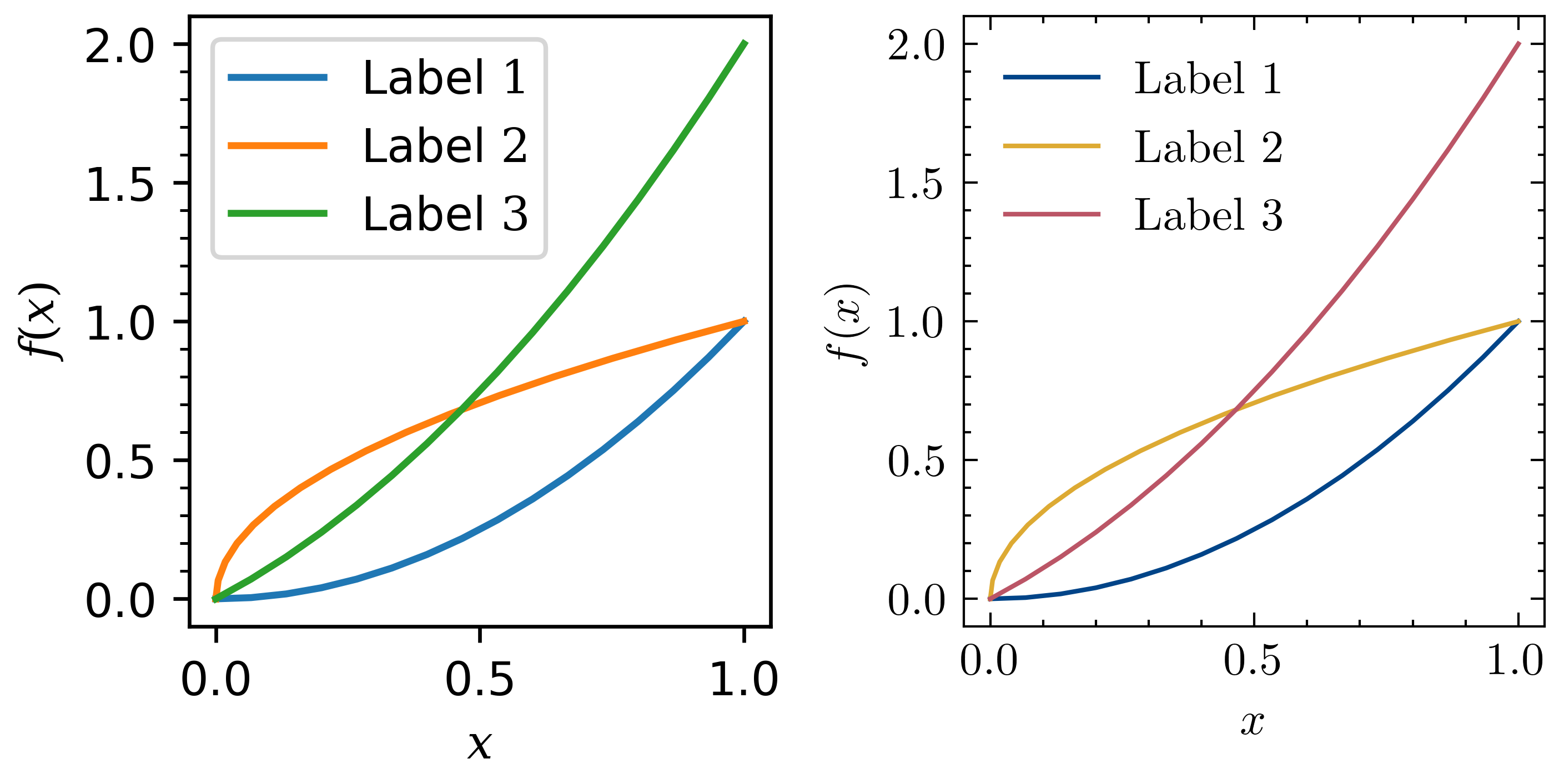
There are a few interesting things to note, first, we have changed the default plotting colors. We have also enabled LaTeX to be used for the labels.
We also changed the direction on the tickmarks on the axis.
Note: Under
OSXthe directory that stores your stylsheets is located at.matplotlib/stylelib/and in Linux (Ubuntu 18.04) under.config/matplotlib/stylelib/.
and yes, we have plotted a figure with two axes, and the axes have different style, simply like this
fig = plt.figure()
gs = fig.add_gridspec(nrows=1, ncols=2)
ax1 = fig.add_subplot(gs[0,0])
... # plot what you want
plt.style.use("new_style")
ax2 = fig.add_subplot(gs[0,1],sharey=ax1)
... # plot what you want
2023
Back to top ↑2021
Advanced Scientific Matplotlib - Part 1/n
This series of blog post is here to give some of the tricks I use to produce high-quality figures, suitable for publications.
2020
Compact Schemes for the Poisson Equation
If you prefer to follow in the notebook directly, you can also get the notebook.
APS-Division of Fluid Dynamics
Abstract and video of my talk at APS-DFD 2020
My First Post
Trying all that markdown has to offers